
Color Contrast
Some users have difficulty perceiving text if there is not enough contrast between the foreground and background. The W3C Web Content Accessibility Guidelines (WCAG) 2.1 define specific contrast ratios that must be met in order to comply at particular levels:
- Level AA: 4.5:1
- Level AA (large text): 3:1
- Level AAA: 7:1
- Level AAA (large text): 4.5:1
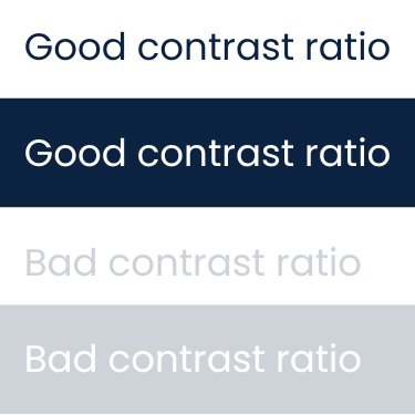
A visual example demonstrating how color contrast impacts readability, highlighting best practices and common pitfalls to support accessible course and content design.
Tools for Color Contrast
Several free tools are available to check color combinations for WCAG compliance, including:
-
WebAIM Color Contrast Checker: The WebAIM Color Contrast Checker is an online tool that assesses the compliance of two colors with WCAG guidelines. Users can input hex values for each color or select colors using a color picker widget. The tool calculates the contrast ratio and provides a “Pass” or “Fail” rating for accessibility standards. Additionally, the site has a slider feature that allows users to adjust the lightness or darkness of either color until a “Pass” is achieved.
-
Microsoft Word: Microsoft Office’s “Check Accessibility” built-in feature will flag “Hard-to-read text contrast” when the ratio of the text and the background falls below a certain threshold. Use the prompts in the Inspection Results to increase the contrast.
-
PDF: Adobe Acrobat’s built-in Accessibility Checker includes an option “Document has appropriate color contrast” that can be toggled on/off with a checkbox. However, this only results in a warning that the color contrast must be reviewed manually. Color contrast should first be reviewed in the document’s authoring software before exporting or saving it as a PDF.
- Canvas: The default text style in Canvas provides the correct ratio for color contrast. However, if you change either the foreground or background color of text on a Canvas page, be sure to use Canvas’s accessibility checker to ensure the colors you’ve chosen satisfy accessibility requirements.
WCAG 2.1 Success Criteria
The color contrast issues described in this section map to the following success criteria in the W3C’s Web Content Accessibility Guidelines (WCAG) 2.1:
- 1.4.3 Contrast (Minimum) (Level AA)
- 1.4.11 Non-text Contrast (Level AA)